- Russell Lewis UI/UX Designer
- WorkAbout Me

Note: Due to company copyright restrictions and pending patents, specific images, UI screenshots, or proprietary design artifacts from this project cannot be shared publicly. However, all outcomes, methods, and results described here reflect my direct contributions to the work.
UX Design Lead
Figma, Sketch, Google Analytics, Jira, Confluence
June 2023 - May 2025
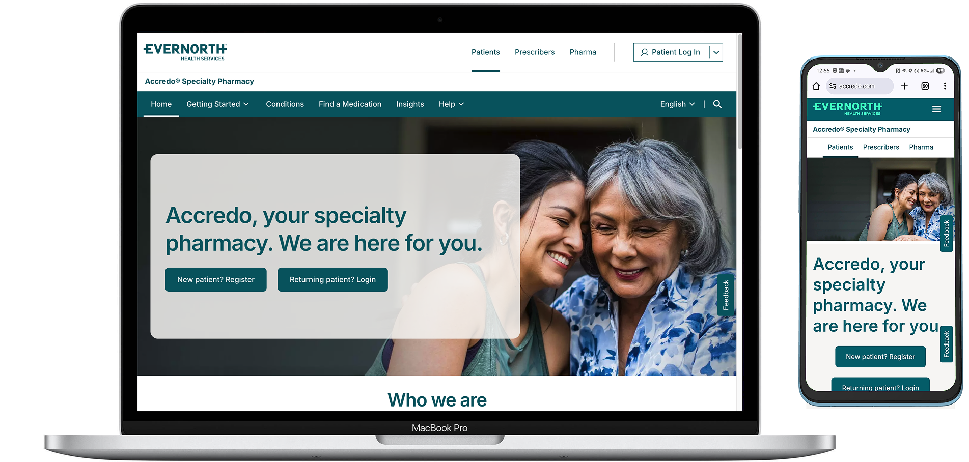
Accredo is the specialty pharmacy division of Evernorth. It supports over 100,000 patients nationwide who are managing complex and chronic health conditions such as cancer, multiple sclerosis, and rare diseases. As a trusted healthcare partner, Accredo provides personalized care, specialty medications, and patient support services to ensure better treatment outcomes. The goal of this project was to redesign the navigation menu to accommodate new branding, implement new navigation points, and adhere to WCAG accessibility guidelines, all while increasing usability for the different types of end-users.
Through user feedback, we were alerted to issues with the previous navigation menu. There were too many drop-down menu items and no navigation hierarchy. Users were having a difficult time landing on the appropriate page to view the information they were seeking. This in turn, steadily increased the number of calls into the customer service center, resulting in the majority of these calls ending with the customer service representative taking additional time to assist the user personally. We also discovered issues with accessibility. The site itself was not in compliance with WCAG (Web Content Accessibility Guidelines) standards. This provided the opportunity to address accessibility issues as well as, establish a design system for efficient and faster development.
Bounce rate for new users
I led in-depth user research and testing to uncover key insights. We conducted interviews, surveys, and both moderated and unmoderated usability tests with patients and caregivers to identify pain points, validate design decisions, and uncover opportunities for improving the digital experience.
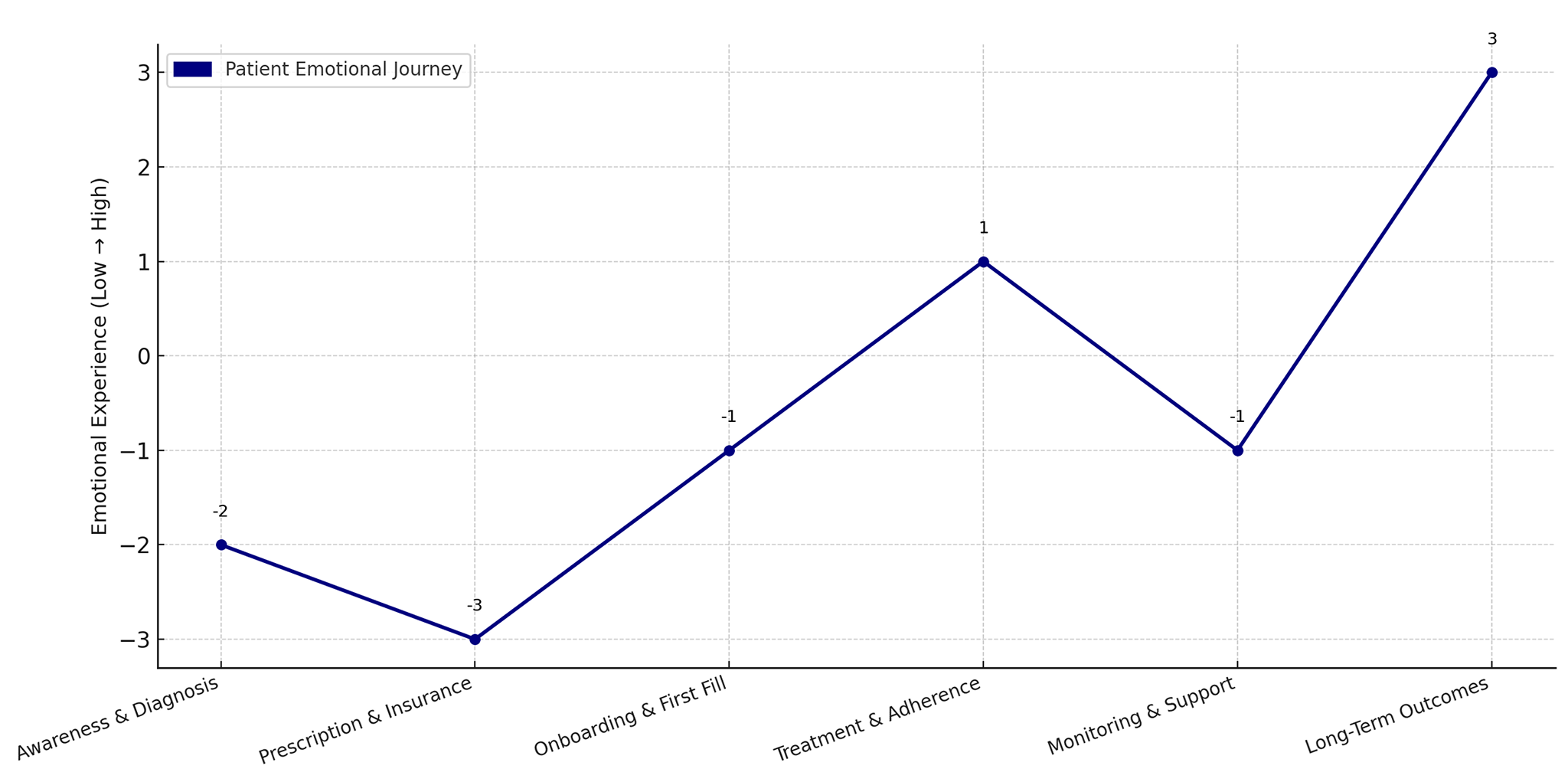
We mapped user journeys and used previously crafted personas to guide design strategy. The end-to-end journey maps and detailed personas represented core patient segments. These artifacts highlighted friction points, accessibility gaps, and unmet needs–shaping the design direction and prioritization.
Specialty Patient Journey Map

Post-login Navigation Ideas

After many iterations and additional testing, I delivered high-fidelity, accessible Figma prototypes for both mobile and web incorporating accessibility best practices and ensuring visual and functional consistency across the product ecosystem.
We utilized those prototypes for additional user-testing, and established KPIs and WCAG 2.1 AA accessibility targets to measure the impact of the redesign. These metrics ensured the experience was inclusive for users of all abilities and supported ongoing iteration post-launch.
I collaborated and actively participated in sprint planning, daily stand ups, backlog grooming, and reviews with the sales and development teams—ensuring tight alignment between design, development, product, and QA for efficient, on-time delivery.
Reduced bounce rate for new users
Increased user satisfaction
- Reduced bounce rate for new users down to 37% and increased user satisfaction scores by 7-9% through patient-centered design: Improved key UX metrics—such as ease of use, clarity, and trust—by streamlining task flows and optimizing navigation across mobile and web platforms. This uplift directly reflected the value of patient-informed, accessible design decisions.
- Accelerated development by 15% with clear, developer-ready specs: Delivered detailed design documentation, including interaction guidelines, annotated components, and accessibility notes. This reduced ambiguity, minimized rework, and streamlined handoff—leading to a 15% reduction in development time.
