- Russell Lewis UI/UX Designer
- WorkAbout Me

Note: Due to company copyright restrictions and pending patents, specific images, UI screenshots, or proprietary design artifacts from this project cannot be shared publicly. However, all outcomes, methods, and results described here reflect my direct contributions to the work.
UX Design Lead
Figma, Sketch, Google Analytics, Jira, Confluence
June 2023 - May 2025
Accredo patients taking specific "specialty" medications are required (by state and national regulatory associations) to complete a health assessment, to ensure that the medication/s will not have any adverse effects when taken. These assessments can be required on an a first fill, refill or annual basis. The assessments can also establish scenarios were the medications may need to be paused and reevaluated by the prescriber.
Previously, patients were required to either download a form, complete it and fax it back to Accredo or they would call and speak with a customer service advocate to provide the answers for the assessments–a time-consuming process that created friction for both patients and care teams.
A new self-service process should prioritize ease of use, accessibility, and patient autonomy. Through a simplified interface, clear guidance, and mobile-friendly design, the experience should greatly reduced reliance on call centers and improve task completion rates. This shift will not only enhance patient satisfaction but it will also free up clinical staff to focus on higher-value interactions.
To address this, a self-service experience was designed that empowered patients to complete these assessments independently, at their convenience.
User interviews with patients and internal call center staff members were conducted to understand where the current process was breaking down. These insights revealed pain points around accessibility, time burden, and confusion forming the foundation for the self-service design strategy.
New, intuitive, accessible form designs were created to optimize both desktop and mobile experiences. Wireframes and high-fidelity prototypes were used to test layouts, input patterns, and error handling, iterating based on feedback to reduce user friction and guide patients through each step confidently.
Usability testing was performed across devices to ensure the experience were seamless and reliable, regardless of the platform. This helped uncover context-specific issues (e.g., form field behavior on mobile) and validate that patients could complete assessments easily without assistance.
I then worked closely with product managers, analysts, and operational leads to define KPIs such as task completion rate, abandonment rate, and call volume reduction. Post-launch analytics were used to track performance, identify further improvement areas, and validate the impact of the self-service solution.
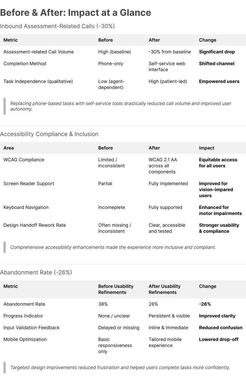
Drop in inbound assessment-related calls
Reduced abandonment rate
- Achieved a 30%+ drop in inbound assessment-related calls: By replacing a phone-dependent workflow with a patient-friendly self-service interface, we significantly reduced the need for support calls. Thoughtful interaction design, clear task flows, and inline guidance enabled patients to complete assessments independently, contributing to a measurable 30%+ decrease in call center volume post-launch.
- Reduced abandonment rate by 26% through usability refinements: After initial testing, I identified friction points causing user drop-off–such as unclear progress indicators and mobile form fatigue. Through targeted design adjustments like persistent progress tracking, input validation feedback, and mobile-specific optimizations, we cut the abandonment rate by 26%, leading to a smoother and more confident user experience.
- Improved accessibility using WCAG-compliant design patterns: Integrated WCAG 2.1 AA-compliant patterns throughout the experience, including proper contrast ratios, keyboard navigation, screen reader support, and form input labeling. These accessibility upgrades ensured equitable access for all users—especially patients with visual, motor, or cognitive impairments—and strengthened overall design quality.
